NHL
You’re Going to Wear That?! 5 Best & Worst NHL Retro Jerseys
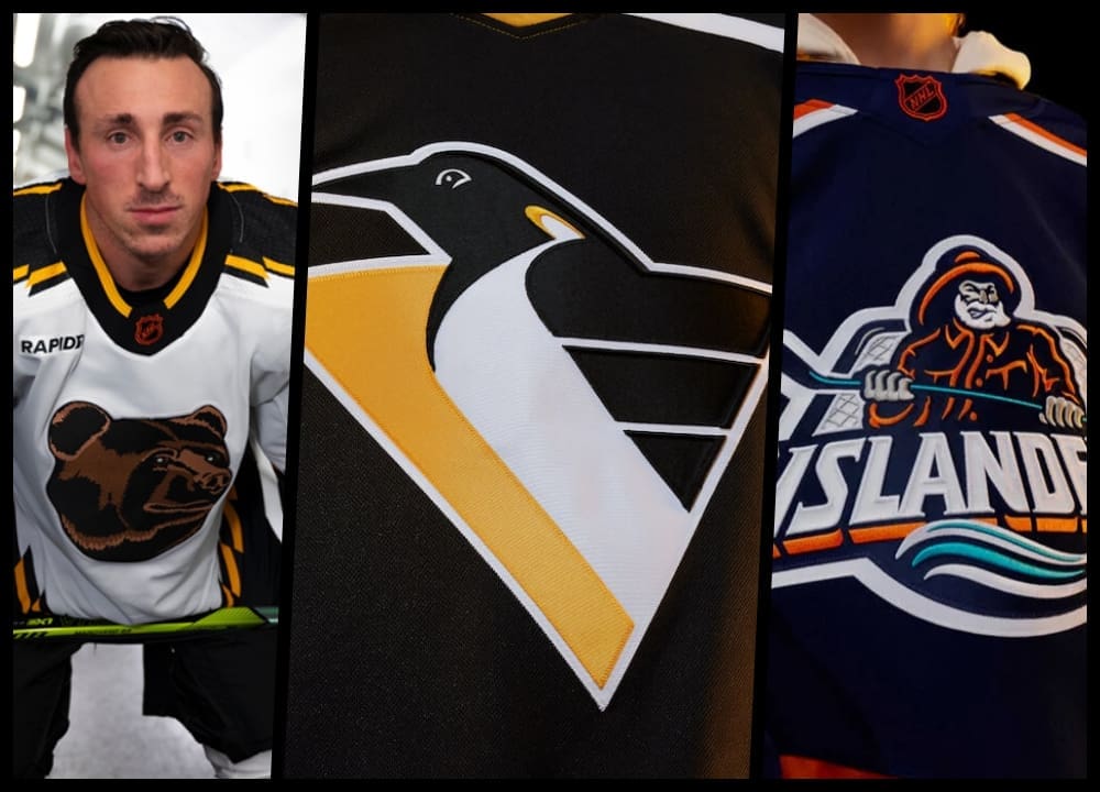
The NHL reverse retro jerseys 2022 are out of the box. And many should go back in. While many teams should be called for roughing after what they’ve done to our eyes, such as the blessedly banished New York Islanders’ Fisherman and the Anaheim Ducks’ “Mighty Ducks” logo, a few teams got it right.
Our apologies to colleagues who fondly remember the Penguins’ robo-pigeon. A few of us had to cover the Generation Next and X Generation. A few of us moped for days after the Mario-led Penguins’ three-peat bid crashed, and bankruptcy created a constant specter of relocation, contraction, and losing. The robo-pigeon debuted in 1993, and it was all downhill from there. It was the most tumultuous era of Penguins hockey. In addition to the constant frustration and sinking fates, Mario Lemieux had non-Hodgkins lymphoma, retired, and defense-first task master Kevin Constantine became the coach.
Also, it’s not pretty.
However, the Pittsburgh Penguins did not make either NHL reverse retro jersey top-five list (Though they were much closer to our bottom five).
Top 5 NHL Reverse Retros Jerseys
5. Montreal Canadiens
The bleu, blanc et rouge should never be changed or tinkered with, but Montreal did a nice job creating a new sweater that keeps the “Canadiens” heritage. Simple is usually better.
Count me a fan of the light blue with contrasting blue bands and the traditional logo.

4. LA Kings
The purple and gold are back! They weren’t the most popular jerseys in their day, but they had a regal panache and cult following. Marcel Dionne. Young Bernie Nichols and Luc Robitaille.

They remain perhaps the most unique and interesting jerseys in NHL history. They mirror the NBA’s Laker color scheme (more cities should share colors) and always symbolize LA.
3. Chicago Blackhawks
The Blackhawks organization needs a win. By their own hand, they’ve self-destructed publicly, and their stars are ready to go. However, the retro jersey is in keeping with the style of their Original Six sweaters.
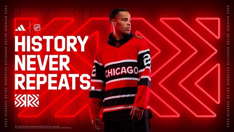
Original Six is always good. It’s a very wearable black and red. Nothing silly. No embarrassing logos. Well done.
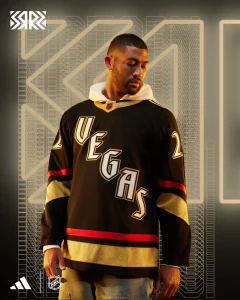
Shocked that Vegas would get it right? The jerseys are a little garish for old-white man tastes like mine, but if you know the history, they become pretty cool.
The lettering is from the Excalibur Hotel. The numbers are meant to replicate the lost Vegas treasure, Stardust Hotel.
Oh, and the jersey glows in the dark during The Fortress pregame presentation. It’s not my cup of tea, but I’d happily splurge on one for the kiddos.
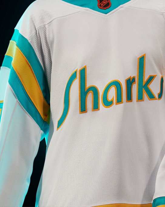
1 San Jose Sharks
Somebody had a great idea, and someone else agreed. The San Jose Sharks are abandoning the “Seals” on the crest but honoring those 1970s California Golden Seals, the Flint Tropics of their day. White skates. Special colors. And backstories for days. The sweaters aren’t for everyone, but they stand out and tell a great story.
Top 5 Worst NHL Reverse Retro Jerseys
This list was much harder to curate. There were so many from which to choose. Honorable mentions to the Pittsburgh Penguins’ reverse retro and the Washington Capitals’ starred eagle-fang karate logo.
5. Boston Bruins
The Pooh Bear!
The Boston Bruins reverse retro recalls the most reviled sweater in the Original Six’ers history. The retina-burning gold base with a giant bear head. The jersey made its debut in 1995, long before smartphones made emojis popular.
You see where I’m going with this, right? Is it the Pooh bear or the Poo bear?
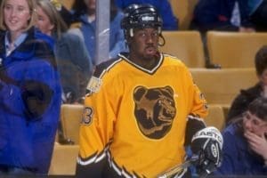
Even Anson Carter can’t believe it.
4. The Edmonton Oilers
Does it come with toast? That ain’t no dippy egg. (Please note the proper usage of yinzer terminology,)

3. The New York Islanders
You can always trust the Gorton’s Fisherman. Good God almighty, these things were ridiculed non-stop even before social media was a thing. We didn’t need thousands to see our derision and mockery stuffed into 280 characters. Instead, the hockey universe laughed together. They’re back!

“I know not all that may be coming, but be it what it will, I’ll go to it laughing,” — Captain Ahab, Moby Dick.
2. Vancouver Canucks
Is anyone else humming a Monty Python song or waiting for a Dave Thomas SCTV sketch? It’s Johnny Canuck. He’s a lumberjack, and he’s OK.

1. Tampa Bay Lightning
It’s not easy to take the top spot on this list, but the Lightning have done it. More! We need more lines. How about some waves at the bottom? More colors. Let’s add some black. People love black! Oh, and we’ll put lightning bolts in the black, too. Big ones! This is gonna be so cool. We’ll have more stuff than all of the other jerseys combined!

